
I thought I'd use an illustration of my connections on LinkedIn Inmaps to emphasize both the power of Visual Analytics (A picture is worth a thousand words. Let's see if this blog-post reaches 1000 words :p) as well as talk further about what differentiates an analysis from a report.
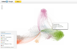
Before I get into what this image reveals, I wanted to highlight a couple of things. This image is a unique way to represent very complex and large n-dimensional dataset. In the age of Visual Analytics and the popularity of various VA tools such as Tableau, Qlikview, Microstrategy and JMP, this is a neat neat way of representing really complex multi-dimensional data (All people who you are connected to and everyone they are connected to is probably going to become a Million rows x Million columns dataset. I am not sure if this visualization has looked at second level connections in which case the data becomes even more complex). Another key insight from this is the fact that Color is one weapon that we don't use often enough in projecting charts to represent multi-dimensional complex data.
This representation captures quite a few things and projects these insights in a simplistic fashion:
- What are the various social/professional/educational networks you are a part off?
- Big Clusters in different colors
- I had 4 major clusters (HKUST/LBS on the West representing the global network largely based in HK and London , Mu Sigma and Dell on the East representing analytics in Bangalore and UVCE and Infosys/Gap on the South and North respectively representing the IT side of Me)
- How well-connected are these networks?
- Size of the clusters
- HKUST is a large well-connected cluster and so is Mu Sigma. UVCE is much smaller and less well-connected.
- Who are the people who are connectors across networks?
- Dots that are between two clusters and of a reasonable size
- Santosh Atre, Tapan and Navin D connects Infosys and Mu Sigma and Bharath Murali connects Bethany and Mu Sigma networks. Deepak GD connects PESIT Gang and HKUST.
- Who are the key people in your network?
- Size of the bubble indicates how well connected they are.
- If you can identify 4-5 people in each network spread across different networks and stay in touch with them, it might be more efficient than trying to be in touch with everyone in your network. This does have a materialistic angle to connecting to people. But all I am saying is if you had to choose 3 people to get in touch with to get the scoop on what's happening in your school gang, this map probably gives you a good idea.
- Who will be most useful when you have a unique need?
- Possibly someone who is not very well-connected to any of your networks who appears to have a good network (Big Bubble).
- Reasoning: They have good exposure to multiple people in possibly a different field or atleast a different network and will be able to connect you to a unique network of people that you don't have access to. This could be a distant cousin in the real estate broking space who can connect you to a builder friend who will help with building your next house.
Now that I've given you some key questions that get answered with that one image, is the image a report or is it analytics. It depends on who's talking about it (I guess). LinkedIn would call it the best analytics ever whereas someone who saw it but did not get enough context to what this was about or why it is important to him/her thought it was a useless report. While this definitely fits the bill of a Visual Analytics representation of complex data, it would be good analytics only if backed by reason why this is useful to the viewer, what the key insights are and what actions he should take based on the insights. Does this blog-post then qualify as good analytics? ;-) I'll let the readers of the blog decide.
---

To ensure you don't miss any of my blog posts, please click on subscribe to add my blog in your favorite RSS Feed Reader.
 You can also follow me on twitter @rhebbar to get frequent updates on this and my blogs and talk to me on anything under the sun (including investing, entrepreneurship, MBA, cricket,travel).
To ensure you don't miss any of my blog posts, please click on subscribe to add my blog in your favorite RSS Feed Reader.
No comments:
Post a Comment